Saffron Hour tea packaging
Identity and a three-tin packaging system for a fictional small-batch tea brand.

Overview
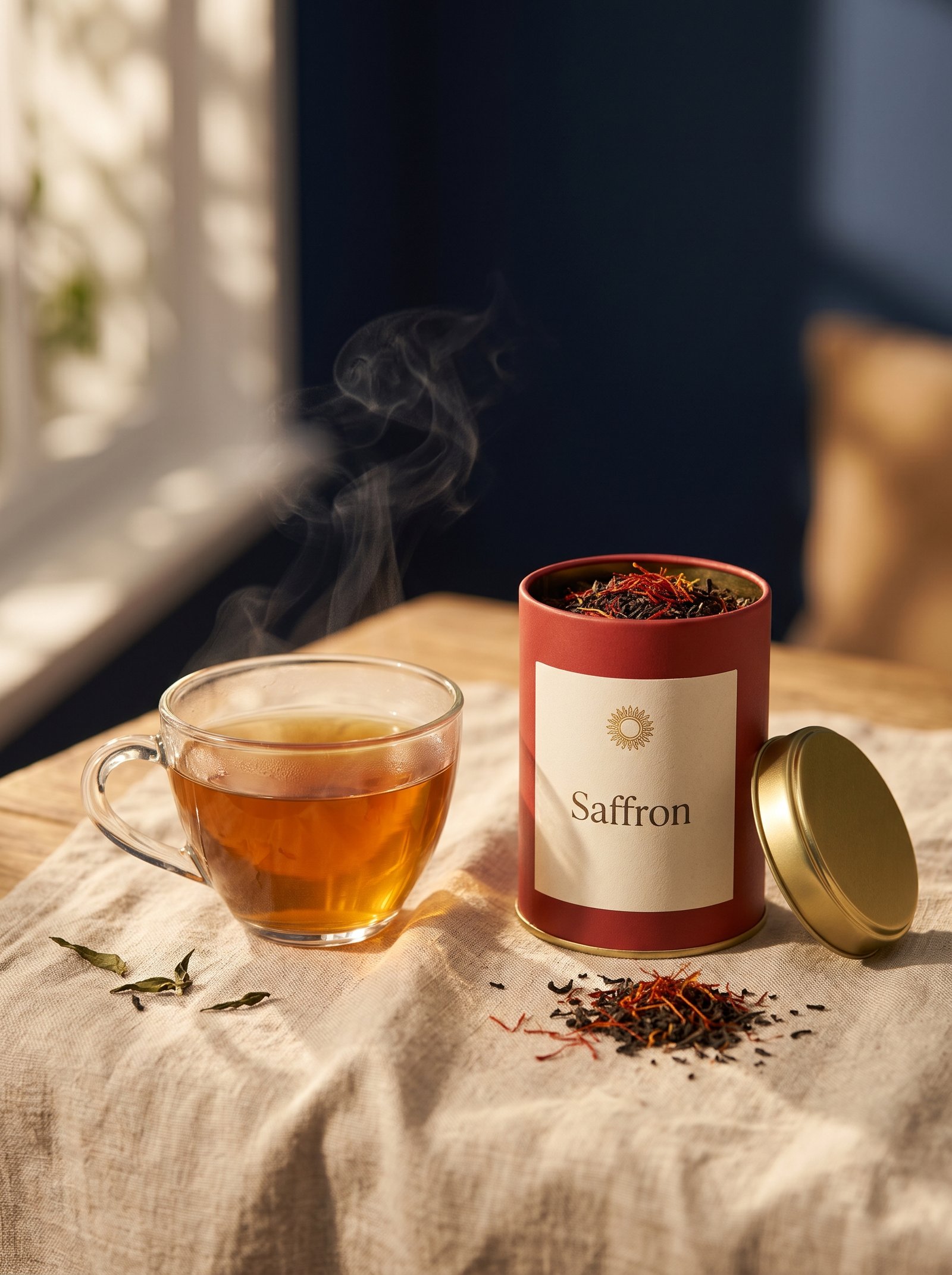
Saffron Hour is a fictional tea brand built around slow afternoon rituals. I designed the identity and a packaging system that works across three blends and is easy to extend.
The challenge
Specialty tea shelves are full of similar earthy boxes. The tins needed to look premium and warm, be easy to tell apart at a glance, and still feel like one family.
My approach
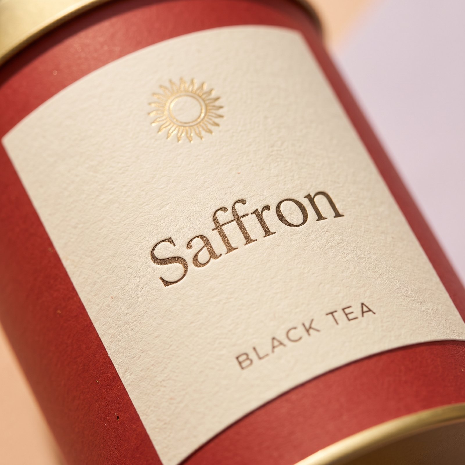
- Built a simple sun mark that works small on a lid and large on a shelf.
- Gave each blend its own color (saffron red, honey gold, garden green) on a shared cream label grid.
- Used an elegant serif for blend names and clean small caps for details.
- Prepared print-ready dielines with bleed and color specs.
What I delivered
Logo and color paletteThree label designs on one shared gridPrint-ready files and product mockups
What I learnedA strict shared grid is what lets three very different colors still read as one brand.
This is a self-initiated concept project. The brand is fictional and was created to show my process.